Unassigned
Why Websites Show Mountains for Missing Images?

A small square with two mountain peaks appears on screens worldwide. This symbol shows up when an image fails to load on a website or app. Many users recognize it instantly without needing explanation. The design signals that content should be present but is currently unavailable.
Different platforms display slight variations of this icon. Some versions include a sun, sky, or broken frame effect. Others appear more minimal with simple outlines. The meaning remains consistent across all designs despite visual changes.
 Via Fast Company
This icon has become part of daily digital interaction. It appears in documents, browsers, presentations, and even vehicle screens. Users rarely question its origin while using it. Its familiarity makes it one of the most recognizable digital placeholders.
 Via The Conversation
This icon also represents potential content. It suggests that an image should appear in that space. That expectation helps users understand system behavior. The design bridges the gap between space and visual content. Its simplicity ensures that meaning is not lost, making it a reliable and versatile choice in modern interface design.
Clarity plays a major role in icon design. A strong symbol reduces confusion and improves navigation. The mountain shape works because it is easy to identify at any size. Its structure remains readable even on small screens. Whether rendered in full detail or reduced to a minimal outline, the concept of a mountain remains recognizable.
 Via Symbolixe
 Via LinkedIn
The mountain icon fits into this global system of communication. It works across languages and cultures without confusion. Designers rely on such symbols to create universal digital experiences. Simplicity remains the key to effectiveness.
Common symbols create shared understanding across platforms. A magnifying glass represents search in most applications. A trash bin indicates deletion in nearly every system. These consistent meanings reduce learning time for users.
 Via The Conversation
 Via Vecteezy
Over time, more refined designs replaced basic placeholders. Designers experimented with clearer and more intuitive visuals. The mountain shape gradually became a leading choice. Its simplicity made it suitable for widespread adoption.
Basic designs first appeared as simple shapes or broken frames. These early placeholders helped users understand loading issues. They marked empty spaces where images were expected. This reduced confusion during browsing.
 Via Clickermonkey
 Via iPhone Photography
Digital designers may have adopted this familiar symbol later. The mountain shape already represented images and scenery. That connection made it ideal for placeholder use. Its transition from cameras to digital platforms felt natural.
Camera interfaces helped normalize the mountain shape in visual culture. Photographers became familiar with this symbol long before modern apps. The design connected photography with natural scenery. This association strengthened its meaning over time.
 Via Adobe Stock
 Via Connolly Cove
Western art also uses mountains as symbolic backgrounds. Paintings and illustrations include them to suggest scale and space. Their universal recognition strengthens their visual impact. This cultural background supports their use in digital icons.
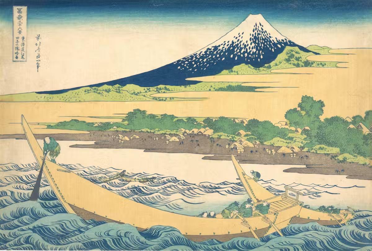
Japanese woodblock prints often feature mountain landscapes. Famous works show Mount Fuji from different perspectives. These images highlight the importance of natural scenery in design traditions. Mountains become central visual elements in many compositions.
 Via National Geographic
 Via Wikipedia
Digital design benefits from symbols with universal meaning. The mountain shape communicates ideas without language barriers. Users interpret it consistently regardless of background. That universality makes it highly effective in interface design.
Cultural traditions across the world highlight mountains as meaningful landmarks. They represent obstacles, goals, and unknown spaces. Many stories use mountains as settings for discovery. This reinforces their visual significance. Instead, they become powerful reminders of ambition, resilience, and the human desire to reach beyond what seems possible.
 Via Conde Nast Traveler
 Via Mobile Pay Insight
The symbol also appears outside traditional computing environments. It can be found in infotainment systems and digital displays. Its expansion into different technologies shows its adaptability. The design continues to remain relevant. Whether painted in soft, atmospheric tones or bold, dramatic contrasts, mountains bring structure and emotion to artwork.
Some platforms modify the icon slightly for branding purposes. Adjustments include color changes, outlines, or added symbols. Despite variations, the core mountain shape remains unchanged. Recognition stays strong across all versions. Writers often use mountains to frame moments of transformation or challenge, where characters confront both physical obstacles and inner struggles.
 Via Pinterest
Designers use this emotional response to improve user experience. A neutral placeholder avoids frustration during loading issues. Instead of confusion, users see a familiar symbol. That familiarity reduces uncertainty in digital environments. Their presence not only enriches the visual experience but also deepens the meaning behind the piece, reinforcing themes of endurance, isolation, and discovery.
 Via Vecteezy
Design systems prioritize efficiency in communication. A single symbol should carry a complete message. The mountain icon achieves this with minimal design effort. Its simplicity ensures long-term effectiveness. Users recognize its meaning instantly without instruction. That recognition makes it highly effective.
More in UnassignedVia Fast Company
This icon has become part of daily digital interaction. It appears in documents, browsers, presentations, and even vehicle screens. Users rarely question its origin while using it. Its familiarity makes it one of the most recognizable digital placeholders.
Purpose and Meaning Behind the Symbol
Digital systems require clear signals for missing or loading content. The mountain icon fulfills this need by providing a simple visual cue. It communicates absence without requiring a written explanation. Users understand the message almost instantly.Via The Conversation
This icon also represents potential content. It suggests that an image should appear in that space. That expectation helps users understand system behavior. The design bridges the gap between space and visual content. Its simplicity ensures that meaning is not lost, making it a reliable and versatile choice in modern interface design.
Clarity plays a major role in icon design. A strong symbol reduces confusion and improves navigation. The mountain shape works because it is easy to identify at any size. Its structure remains readable even on small screens. Whether rendered in full detail or reduced to a minimal outline, the concept of a mountain remains recognizable.
Via Symbolixe
Importance of Visual Language in Technology
Visual language helps people interact with digital systems quickly. Icons replace long instructions with simple shapes. This allows users to understand functions without reading detailed text. Clear visuals improve speed and usability.Via LinkedIn
The mountain icon fits into this global system of communication. It works across languages and cultures without confusion. Designers rely on such symbols to create universal digital experiences. Simplicity remains the key to effectiveness.
Common symbols create shared understanding across platforms. A magnifying glass represents search in most applications. A trash bin indicates deletion in nearly every system. These consistent meanings reduce learning time for users.
Via The Conversation
Early Web Design and Placeholder Images
Early internet systems often struggled with loading images. Slow connections caused frequent display errors. Web developers needed a way to show missing content clearly. Placeholder graphics became a practical solution. As websites became more complex, the need for a clearer visual system to handle missing or delayed content became increasingly important.Via Vecteezy
Over time, more refined designs replaced basic placeholders. Designers experimented with clearer and more intuitive visuals. The mountain shape gradually became a leading choice. Its simplicity made it suitable for widespread adoption.
Basic designs first appeared as simple shapes or broken frames. These early placeholders helped users understand loading issues. They marked empty spaces where images were expected. This reduced confusion during browsing.
Via Clickermonkey
Influence of Camera Landscape Icons
Many digital cameras use a landscape mode symbol. This icon typically shows two mountain peaks under a sky. It represents outdoor scenery and wide framing settings. Users recognize it as a setting for capturing distant views.Via iPhone Photography
Digital designers may have adopted this familiar symbol later. The mountain shape already represented images and scenery. That connection made it ideal for placeholder use. Its transition from cameras to digital platforms felt natural.
Camera interfaces helped normalize the mountain shape in visual culture. Photographers became familiar with this symbol long before modern apps. The design connected photography with natural scenery. This association strengthened its meaning over time.
Via Adobe Stock
Cultural Role of Mountains in Visual History
Mountains appear frequently in art, literature, and storytelling. They often symbolize distance, mystery, and exploration. Artists use them to represent both beauty and challenge. Their presence creates depth in visual composition. In visual art, mountains are equally significant.Via Connolly Cove
Western art also uses mountains as symbolic backgrounds. Paintings and illustrations include them to suggest scale and space. Their universal recognition strengthens their visual impact. This cultural background supports their use in digital icons.
Japanese woodblock prints often feature mountain landscapes. Famous works show Mount Fuji from different perspectives. These images highlight the importance of natural scenery in design traditions. Mountains become central visual elements in many compositions.
Via National Geographic
Why Mountains Carry Universal Meaning
Mountains naturally attract human attention and curiosity. Their size and distance create a sense of wonder. People often associate them with exploration and possibility. This emotional response strengthens their symbolic value. The effort required to climb or even approach them adds to their allure, making them feel both inspiring and humbling at the same time.Via Wikipedia
Digital design benefits from symbols with universal meaning. The mountain shape communicates ideas without language barriers. Users interpret it consistently regardless of background. That universality makes it highly effective in interface design.
Cultural traditions across the world highlight mountains as meaningful landmarks. They represent obstacles, goals, and unknown spaces. Many stories use mountains as settings for discovery. This reinforces their visual significance. Instead, they become powerful reminders of ambition, resilience, and the human desire to reach beyond what seems possible.
Via Conde Nast Traveler
Modern Use Across Digital Platforms
The mountain placeholder icon appears in many modern applications. It shows up in browsers, documents, editing tools, and mobile apps. Even operating systems use similar designs for missing content. Its presence remains consistent across devices.Via Mobile Pay Insight
The symbol also appears outside traditional computing environments. It can be found in infotainment systems and digital displays. Its expansion into different technologies shows its adaptability. The design continues to remain relevant. Whether painted in soft, atmospheric tones or bold, dramatic contrasts, mountains bring structure and emotion to artwork.
Some platforms modify the icon slightly for branding purposes. Adjustments include color changes, outlines, or added symbols. Despite variations, the core mountain shape remains unchanged. Recognition stays strong across all versions. Writers often use mountains to frame moments of transformation or challenge, where characters confront both physical obstacles and inner struggles.
Emotional and Visual Impact of the Icon
Simple shapes often carry strong emotional associations. The mountain icon creates a sense of openness and absence. It suggests something is missing but expected. This balance makes it visually meaningful. The mountain placeholder icon shows how a simple design can achieve global recognition. It combines clarity, familiarity, and meaning in a small space. Mountains also evoke feelings of distance and exploration. Users may imagine landscapes beyond the screen. This imagination adds depth to the symbol. It transforms a space into a point of curiosity. Its success comes from both practical use and cultural symbolism.Via Pinterest
Designers use this emotional response to improve user experience. A neutral placeholder avoids frustration during loading issues. Instead of confusion, users see a familiar symbol. That familiarity reduces uncertainty in digital environments. Their presence not only enriches the visual experience but also deepens the meaning behind the piece, reinforcing themes of endurance, isolation, and discovery.
Connection Between Nature and Digital Design
Nature often influences modern digital design systems. Organic shapes provide comfort in technological environments. Designers use natural references to make interfaces more relatable. This improves user engagement and understanding. As a result, this nature-inspired approach enhances overall user experience. Human perception responds strongly to natural imagery. Familiar landscapes feel easier to interpret than abstract shapes. The mountain design uses this advantage effectively. It bridges the gap between real and digital worlds by translating a familiar natural form into a compact visual symbol that still carries meaning across different interfaces and technologies.The Role of Simplicity in Icon Success
Successful icons rely on clarity and minimal detail. The mountain shape uses only essential elements. This makes it easy to recognize at any size. Simplicity ensures consistent understanding across platforms. That connection keeps it essential in modern interface design. Complex visuals often lose meaning when scaled down. Small screens require clear and bold shapes. The mountain icon maintains readability in all conditions. That reliability supports its widespread use. The design remains stable across time and systems.Via Vecteezy
Design systems prioritize efficiency in communication. A single symbol should carry a complete message. The mountain icon achieves this with minimal design effort. Its simplicity ensures long-term effectiveness. Users recognize its meaning instantly without instruction. That recognition makes it highly effective.